evkita doll
Brand building
Protestant daycare association Delmenhorst & Oldenburg-Land
Brand development of the daycare association
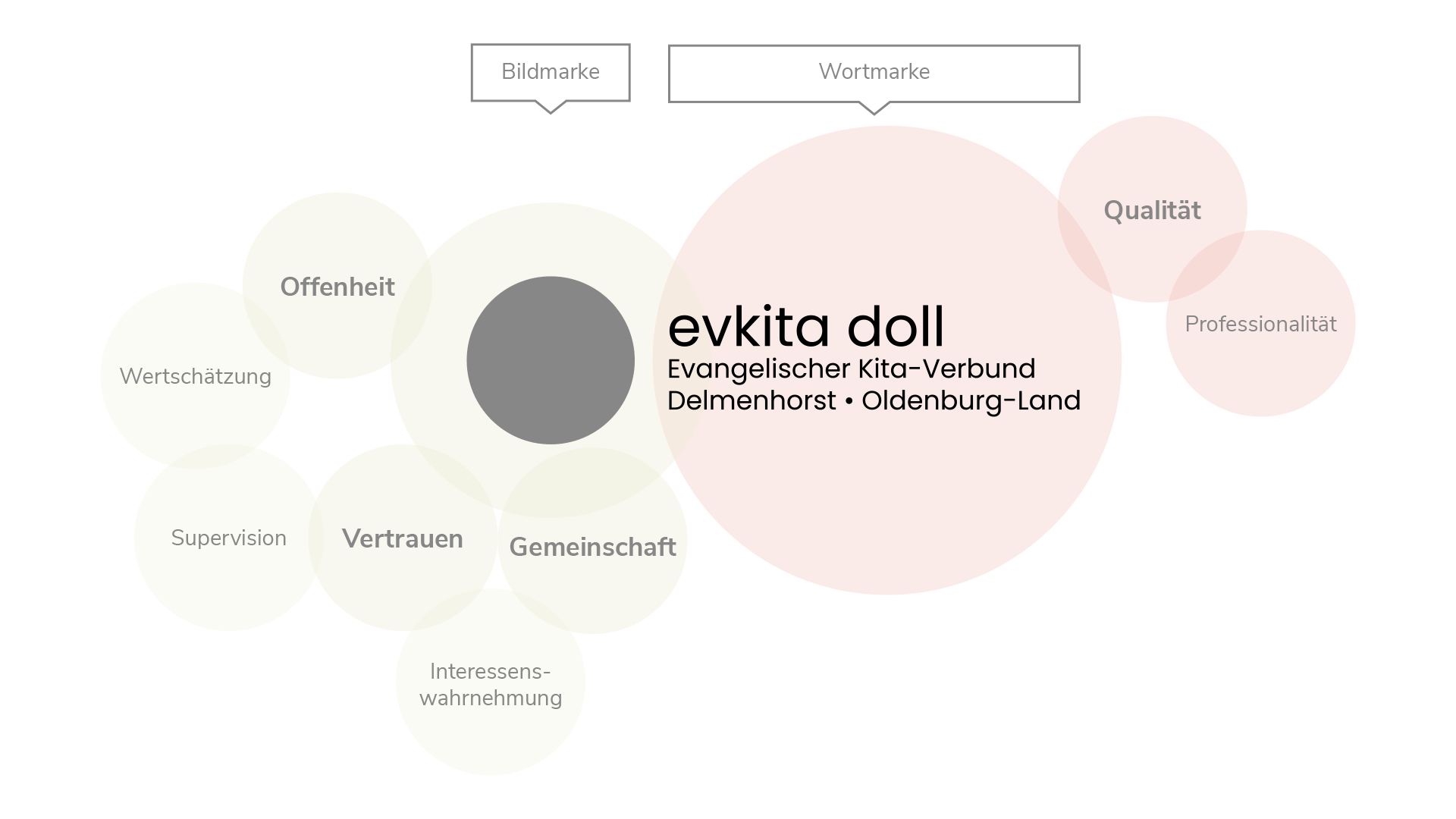
Starting with two brainstorming sessions, we began with the mission of brand building for the KiTa association. During the meetings with the KiTa managers and the management, we worked together to develop elementary characteristics that should be incorporated into the brand. Special questioning techniques and more resulted in clusters of terms, which in turn have a weighty ranking.
We developed the following terms collectively for consideration in the logo development:
The figurative mark
The figurative mark embodies the concepts of openness, trust and community. We were able to implement these concepts very well in color and form.

The word mark
The word mark embodies the concepts of quality and professionalism. Due to the shape of the font, the wordmark appears quite clear and coordinated and thus qualitative.
The final logo
In addition to the brand, our doings were extensive:
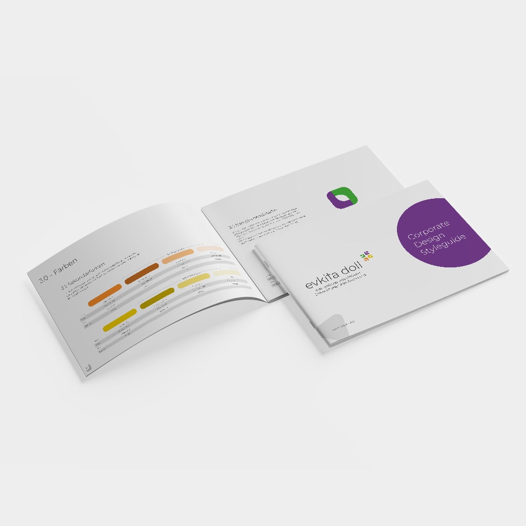
Corporate design manual
Letterhead

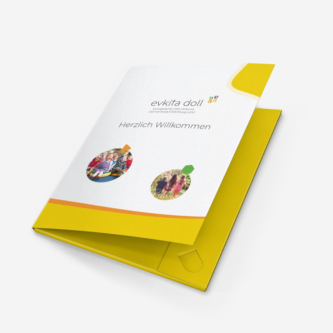
Folders
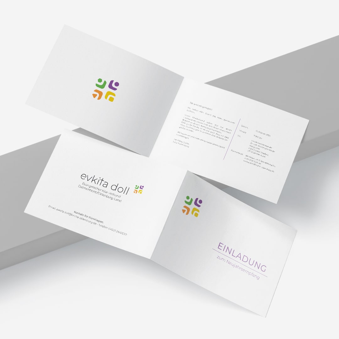
Invitations
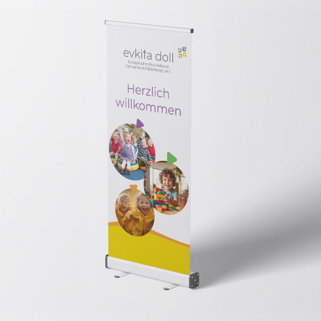
RollUp
Website

To simplify matters, we mainly use the masculine form of language, but include all groups of people (m, f, d) equally.